FTUX Redesign
Gen Digital·2025
Overview
Redesigned the first-time user experience for a mobile consumer security product to reduce cognitive load, establish trust from the first interaction, and build a scalable onboarding foundation for future features.
Role
End-to-end ownership of the mobile onboarding redesign. Responsibilities included heuristic evaluation, problem framing, UX architecture, flow design, and cross-functional alignment with design and engineering.
Approach
With limited time for user research, we ran a heuristic evaluation with five senior colleagues using Nielsen Norman Group principles, mapping the full onboarding journey and identifying 100+ violations clustered around three themes: visibility of system status, consistency, and real-world language match. This provided a structured, defensible baseline for prioritization without needing quantitative data.
Heuristic evaluation 1
Heuristic evaluation 2
Heuristic evaluation 3
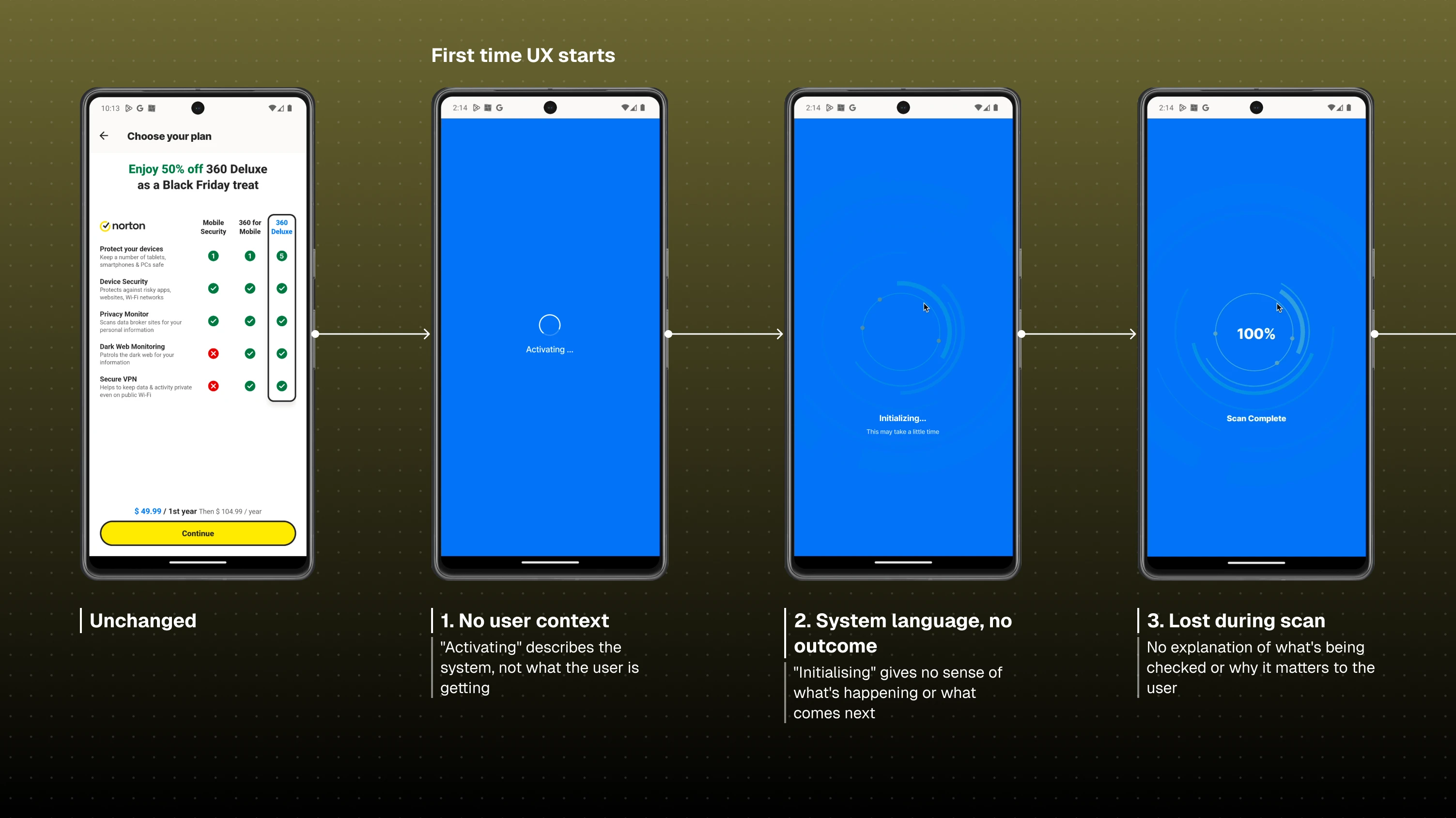
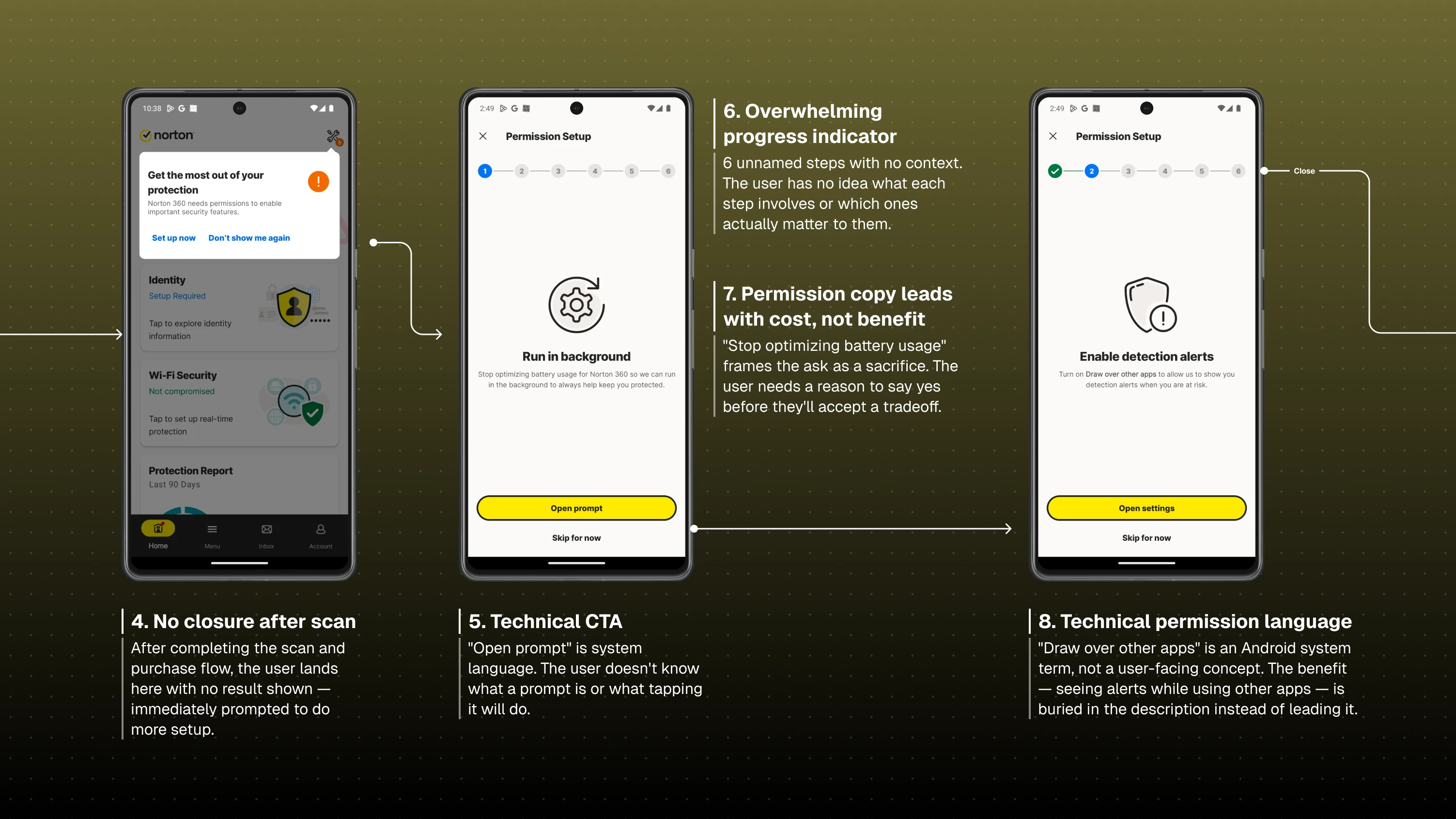
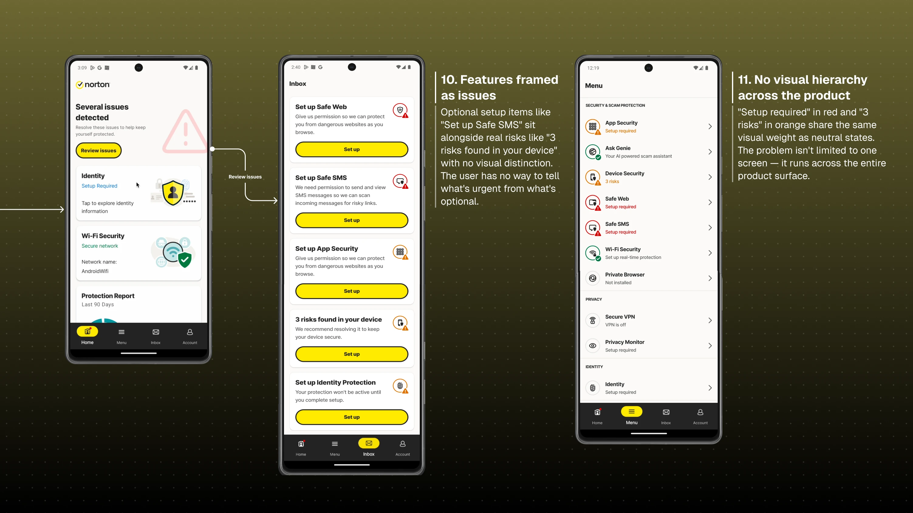
Problem
The existing onboarding experience was system-driven rather than user-driven:
- No value delivered before permissions were requested
- Technical and inconsistent language made flows difficult to parse
- Critical and non-critical actions looked identical, creating false urgency
- Optional features were framed as issues, eroding trust
- The setup model had no room to scale
Solution
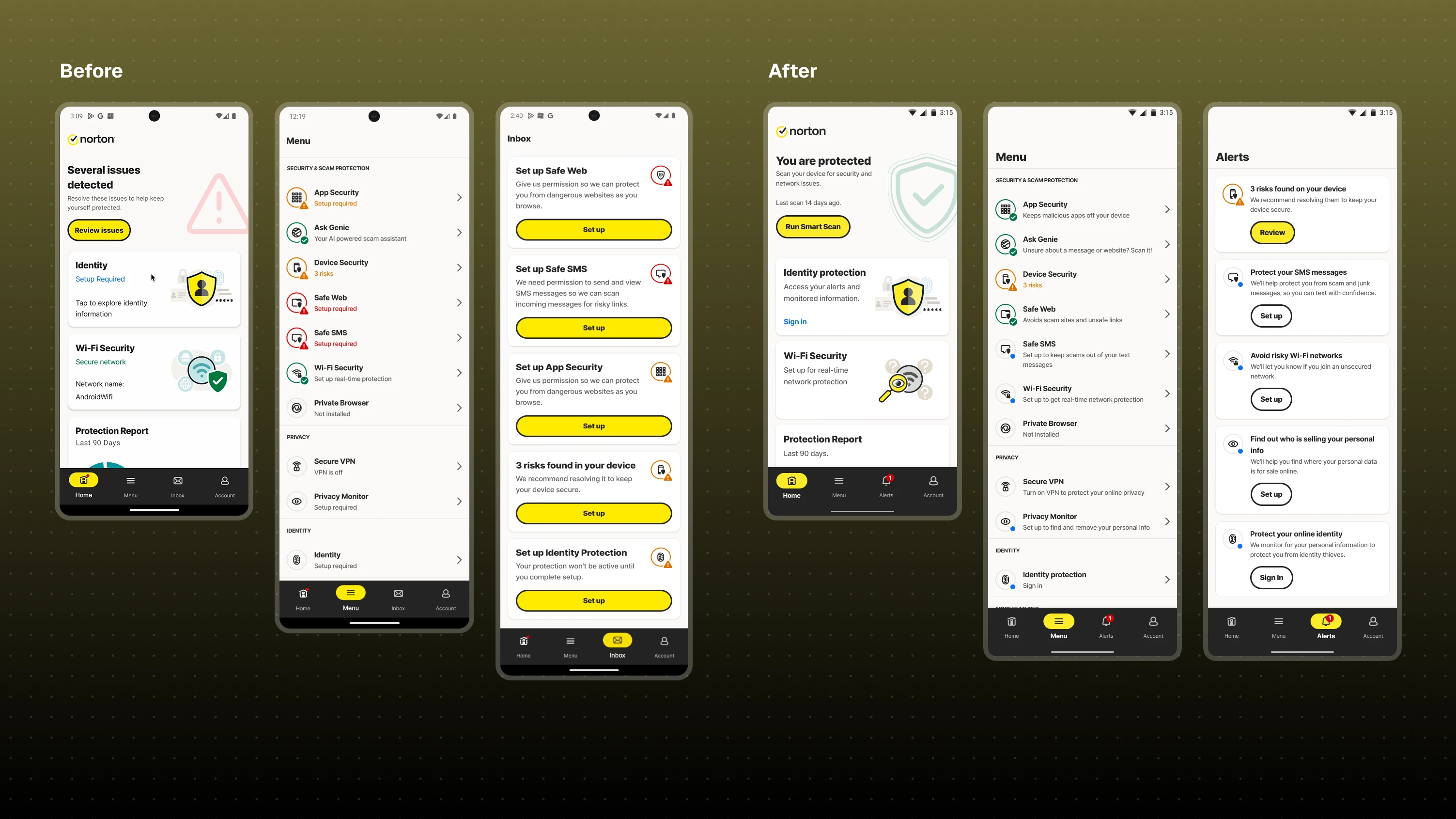
1. Value first — Introduced an immediate app scan post-install to deliver a clear outcome before any permissions are requested. Built trust before asking for anything.
2. Progressive permission flow — Restructured onboarding into a step-by-step sequence, starting with low-friction actions, moving toward complex permissions, with clear feedback at every step and the ability to skip and return.
3. Notification permission first — Before entering Core Protection setup, users are asked to enable notifications. Without this, the app cannot alert users when something harmful is detected, making it the logical first ask. It's also the lowest-friction permission, which means it eases users into the flow before the more complex steps begin.
4. Core protection model — The initial brief called for activating as many features as possible within the FTUX. To avoid an exhaustive setup flow, I mapped all permissions and worked with data analysts in the threats lab to identify which features actually protect users most. Safe Web, requiring 3 permissions and also enabling App Security, emerged as the critical baseline. Without it, the app provides no meaningful protection.
This led to Core Protection, a bundled flow treating these 3 permissions as the essential minimum. Everything else was reframed as optional and moved out of the mandatory FTUX path. Persuading the PM to shift focus from feature activation volume to core protection completion was key to keeping the journey manageable.
5. Feature state & colour system — Defined a clear visual hierarchy: critical risks (red/orange), optional setup (neutral). Removed false urgency from non-critical features and unified it across inbox, menu, and dashboard.
Overview
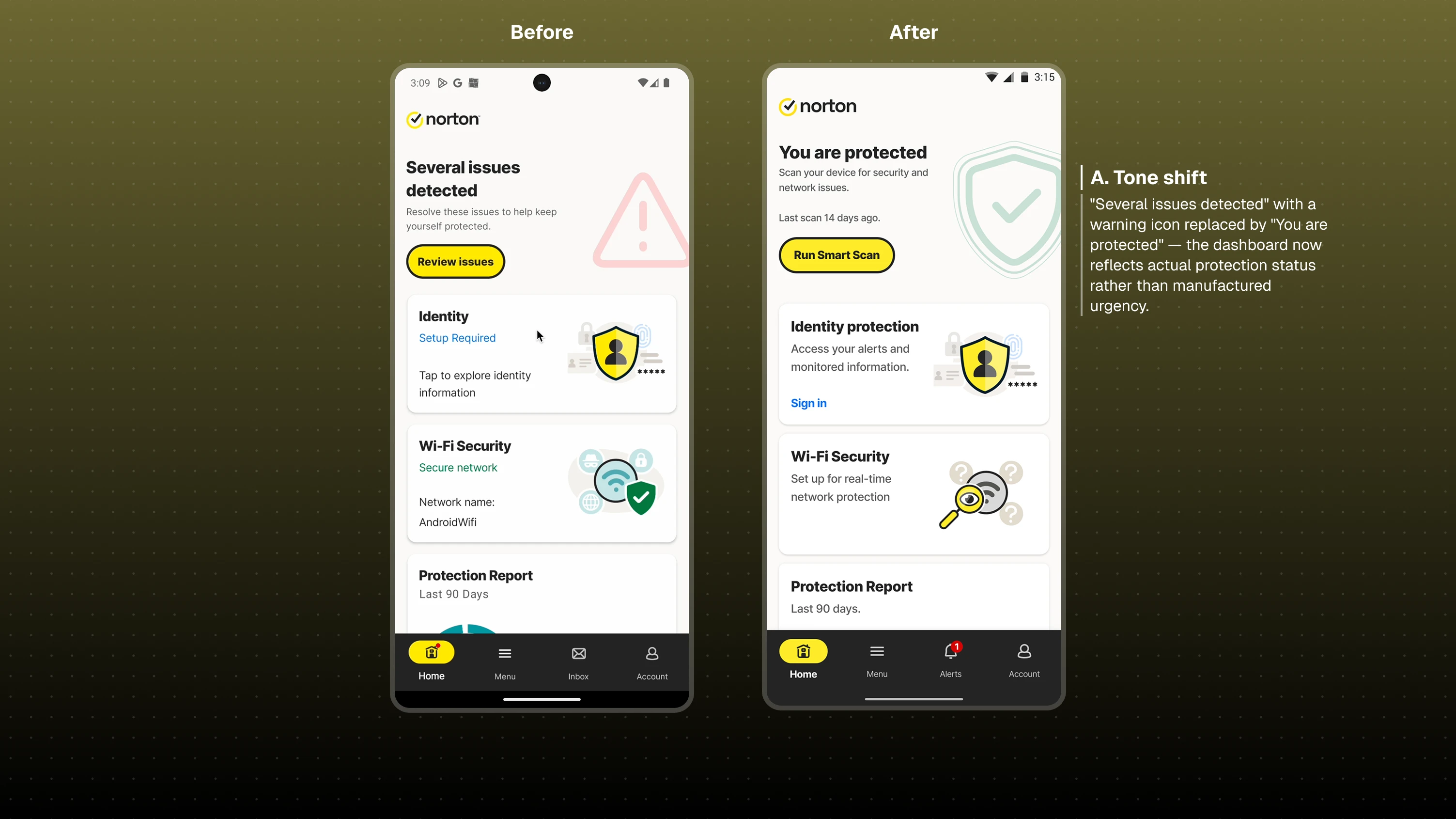
Dashboard
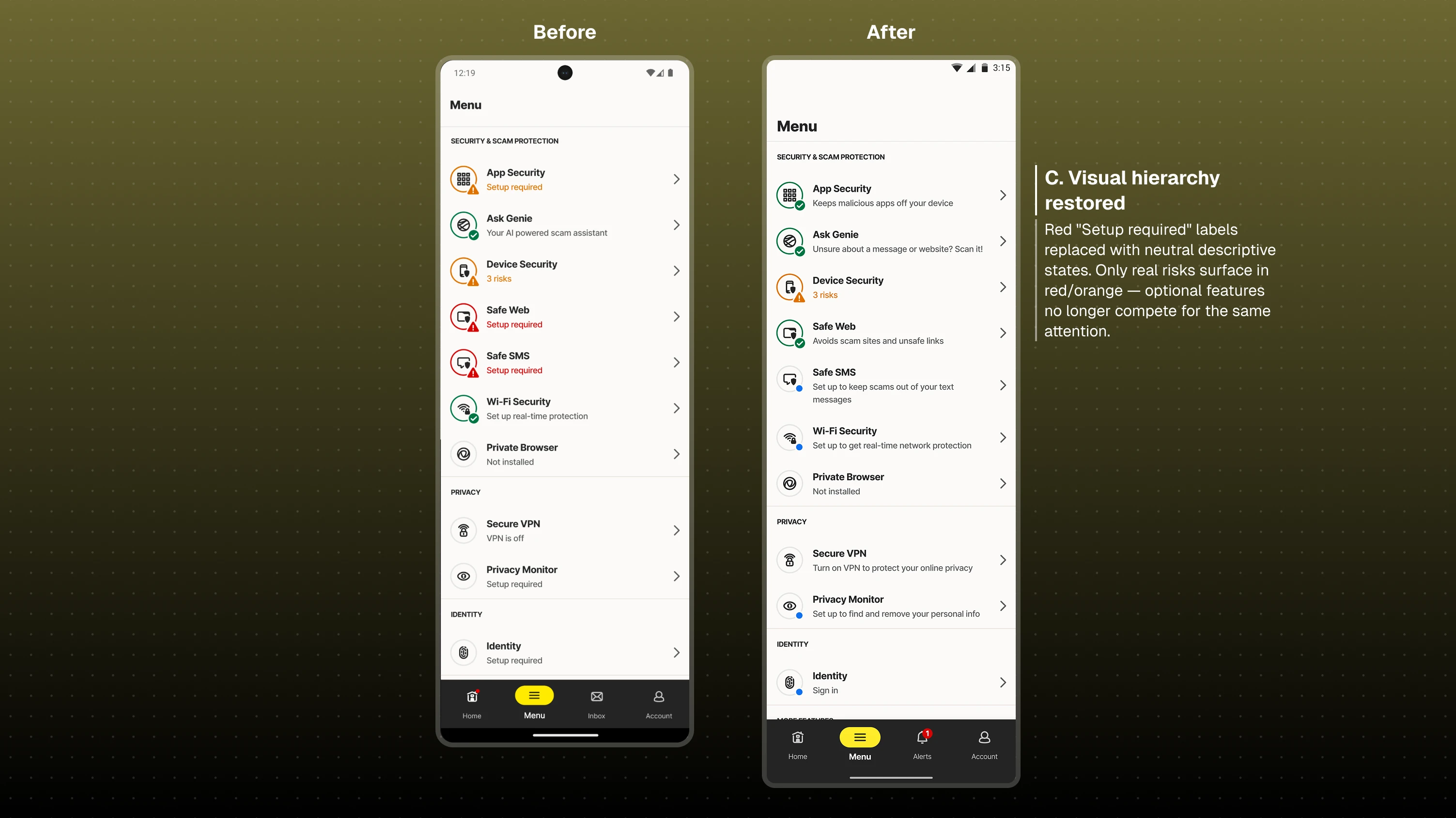
Menu
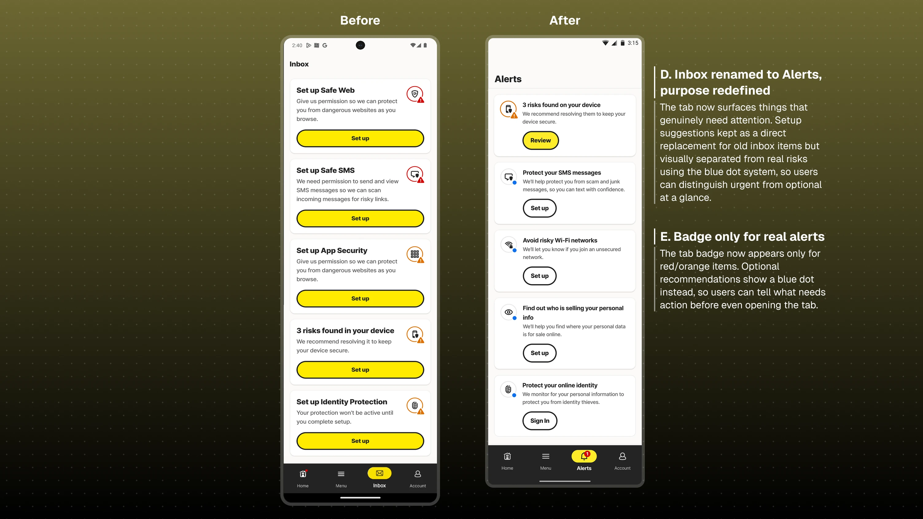
Alerts
6. Continuous feedback and control — Dynamic progress states throughout setup. Final review of enabled vs. missing protections. Clear success states. Always a way forward.
Outcome
- Reduced cognitive load and confusion across the onboarding flow
- Established a scalable onboarding architecture ready for future features
- Shifted product thinking from feature-driven to user-value-driven
- Improved cross-team alignment on onboarding strategy and principles
Reflection
If extended, the priority would be instrumenting proper analytics to measure core protection completion rates, optimise drop-off points, and track whether the redesigned recommendation system drives feature adoption over time.
Longer term, the logical next step is a dedicated feature setup space within the app, a unified place where users can discover and enable features at their own pace. This would allow recommendations to move out of Alerts entirely, keeping that tab focused purely on risks and things needing attention, which is the mental model we started building toward. It also opens up the question of how personalised that journey should be versus playing the expert role and guiding users toward the next best step.